
Description
Responsive Calculator
Responsive Calculator is here to make your life a lot easier when it comes to creating responsive websites. We all know that designing a website that looks good on any screen can be tricky, especially when it comes to images. You want them to look great no matter if someone is on their phone or using a big monitor, right? That’s why it’s super important to have images that resize correctly. Instead of getting caught up in specific pixel sizes—which can be a headache—this app helps you out with just the right calculations!
Why Use Responsive Calculator?
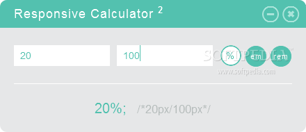
This handy tool quickly figures out the exact percentage of a value for you. Whether you're trying to adjust an image or working with design components, this app has got your back. For instance, if you need to compare the size of an image or figure out how big something should be in relation to its frame, just pop those numbers into Responsive Calculator!
Understanding Em and Rem Units
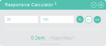
Another cool feature? It helps you calculate em and rem percentages! These are special units of measurement used in web design. So what’s the deal with em and rem? Well, an em is based on the size of an uppercase “M” in any given font interface, making it relative to the text size used.
The Difference Between Em and Rem
Rem, on the other hand, takes things up a notch! It compares sizes based on the top-level element instead of just whatever container it's in. This makes rem super useful when you're designing because it gives you consistent results across your site.
Simplifying Your Design Process
If you're diving into web creation, this feature is priceless! With Responsive Calculator, you don’t have to guess how much to resize your images or tables anymore; just use the app for quick answers.
A Must-Have for Web Developers
This tool is perfect for web developers who need fast and accurate calculations for their designs. Want an easy way to find those essential em and rem values? Look no further! Check out this link.
User Reviews for Responsive Calculator 18
-
for Responsive Calculator
Responsive Calculator is a must-have for web developers. It simplifies the process of calculating percentages for responsive web design. Highly recommended!
-
for Responsive Calculator
Responsive Calculator is a user-friendly and efficient calculation tool, perfect for quick and precise computations.
-
for Responsive Calculator
Simple interface with a fast and highly accurate calculation experience. A must-have for regular calculations.
-
for Responsive Calculator
This app is easy to use and provides accurate calculations while being super responsive.
-
for Responsive Calculator
The Responsive Calculator app offers sleek interface and precise calculations, although it requires a slight learning curve.
-
for Responsive Calculator
Responsive Calculator is user-friendly and tremendously accurate. Perfect for swift math. Needs a bit more features.
-
for Responsive Calculator
Responsive Calculator boasts user-friendly interface, smooth operations, and fast calculation speed.