
Description
COVID-19 Chart Tool
COVID-19 Chart Tool is a handy app that helps you keep track of the Corona Virus pandemic by turning complicated data into easy-to-understand graphs. With all the different news sources out there, it can be tough to know what's true and what's just panic talk. This tool pulls real-time data from ECDC and lets you create customizable graphs for one or more countries.
Easy Data Importing
The app works with imported data, so you need to load your files before you can see any information. It supports XLSX formats, which makes it pretty straightforward to get started.
Select Your Countries
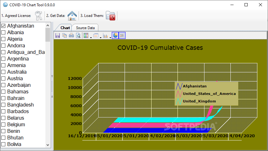
Once you've loaded the COVID-19 data from the European Centre for Disease Prevention and Control, you can choose from various countries. One cool feature of this app is that it lets you preview data from multiple countries at once! This is super helpful for getting a better understanding of how the virus spreads in different areas.
Customizable Graphs
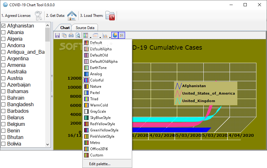
The COVID-19 Chart Tool offers some neat customization options for your graphs. You can pick your preferred chart type and color theme to make your data pop! These choices help separate and identify different datasets easily.
Simplistic Yet Effective Settings
While the graph settings are quite basic, they really do impact how you'll interpret the visualized data. It's a bit bare-bones since there aren't options for customizing things like the graph legend or headers, but it's still effective!
Try It Out!
If you're looking to visualize how COVID-19 spreads across different regions—whether that's one country or many—give this app a shot! The basic tools make it simple to tweak your graphs just enough to give a clear view of what's going on. Plus, if you're interested in getting deeper insights, check out this link for more details about downloading: COVID-19 Chart Tool Download.
User Reviews for COVID-19 Chart Tool 7
-
for COVID-19 Chart Tool
COVID-19 Chart Tool provides real-time data visualization for tracking pandemic stats. Basic customization options enhance data insight.
-
for COVID-19 Chart Tool
This app is fantastic for visualizing COVID-19 data! The customizable graphs make it easy to understand trends.
-
for COVID-19 Chart Tool
I love the COVID-19 Chart Tool! It simplifies complex data into clear graphs, helping me stay informed effortlessly.
-
for COVID-19 Chart Tool
A must-have app for anyone wanting to track COVID-19! The multi-country comparison feature is super helpful.
-
for COVID-19 Chart Tool
Amazing tool for visualizing pandemic data! Customization options are great, and it’s user-friendly. Highly recommend!
-
for COVID-19 Chart Tool
I'm impressed with this app! It provides clear insights into COVID-19 data and allows for easy graph customization.
-
for COVID-19 Chart Tool
The COVID-19 Chart Tool is excellent! It helps visualize important data trends in a simple and customizable way.