
Description
Viewport Size
Viewport Size is a super easy tool that helps you access a big online database of mobile phones and tablets. It gives you all the basic viewport info you need, so when you're creating dynamic web pages or apps, you can keep in mind the different widths of popular devices.
Simple Installation Process
The installation process for Viewport Size is quick and painless. Once it’s done, you can launch the software right away! The layout is simple enough that anyone can jump in and start using it without needing a ton of experience.
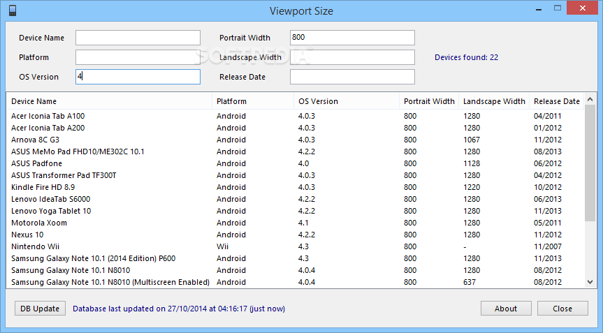
Main Features of Viewport Size
The main window shows all the devices available in its database. You can easily scroll up and down to see the variety of devices listed. This makes it super convenient when you're trying to find specific viewport sizes!
Why Viewports Matter
A viewport is basically the viewing area on a device's screen. Understanding how many different viewports there are can really help web developers like us. It allows us to make better choices when designing apps for mobile phones or creating dynamic web pages.
Search Tools and Filters
This program works as a handy search tool with multiple filters to help narrow down your results. You can type in the ‘Device Name’, ‘Platform’, ‘OS Version’, ‘Portrait Width’, ‘Landscape Width’, or even ‘Release Date’. Check it out here! When you use these filters, Viewport Size will show you all matching devices based on your input.
A Work in Progress
You should know that Viewport Size is still being developed. Right now, it mainly focuses on searching for and displaying devices, but it doesn’t generate any reports just yet. Plus, while its database isn’t huge, there's definitely room for growth!
Your Go-To Utility for Developers
In summary, Viewport Size is an awesome utility that helps website developers figure out which width dimensions are most popular for mobile apps and dynamic web pages we create.
User Reviews for Viewport Size 1
-
for Viewport Size
Viewport Size is a straightforward tool for web developers. Easy installation and basic interface make it user-friendly for quick device viewport information.